Tim Hortons Mobile App
Overview
The Tim Hortons app is designed for users to enjoy the convenience of ordering ahead for pickup, delivery, or dining in. Some customers place their mobile order and pick up in person or at the drive thru. On the app, customer are able to pay for orders, earn and redeem Tims® Rewards points, customers access to personalized offers and rewards, contests, games, and Tims Financial.
As a teacher, I frequently use Tim Hortons App on mobile pick up, drive thru, collecting and redeeming rewards points. While navigating the app, I encountered into different problems ordering a mobile pick up and customers can be making mistake easily and taking unnecessary steps. Teachers that I work with also mentioned some issue they encountered. During the holiday season, teachers often receive Tim Hortons gift cards from parents. However, many teachers and I faced challenges in figuring out how to transfer the gift card balance, resulting in additional time spent on loading the balance. This made me interested to investigate and find out solutions in the problems.
This project delves into the user experience (UX) of the Tim Hortons mobile app, focusing on improving user interface (UI) issues that hinder the customer experience and efficiency.
October 2023 - February 2024
The problems/pain points:
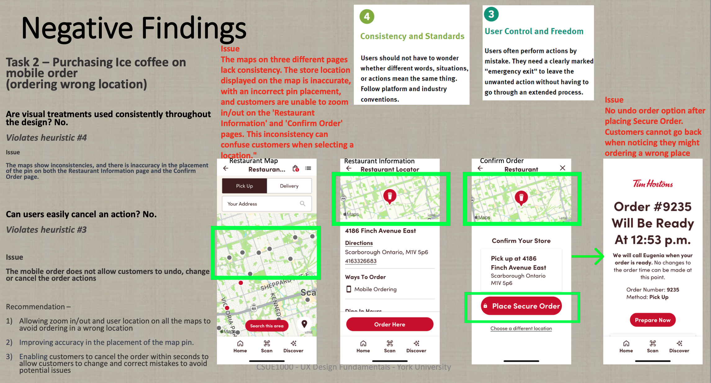
1) It does not track the user’s current location and automatically switch into closest Tim Hortons location. When selecting the ordering location, the app shows all the nearby addresses and customers confused with the correct location they want to make orders. Customers will need to check the map page to ensure a right location is selected.
2)The map pin does not locate accurately on the map when it goes to final step. Customers may potentially think they order in a different location
3) It does not provide notifications on order status or notifications informing their order is ready for pick up
4) There is a lack of clear instructions on reload balance using another gift card. Customers struggle to find a clear instructions to reload balance using another gift card, taking longer navigation times and load the balance.
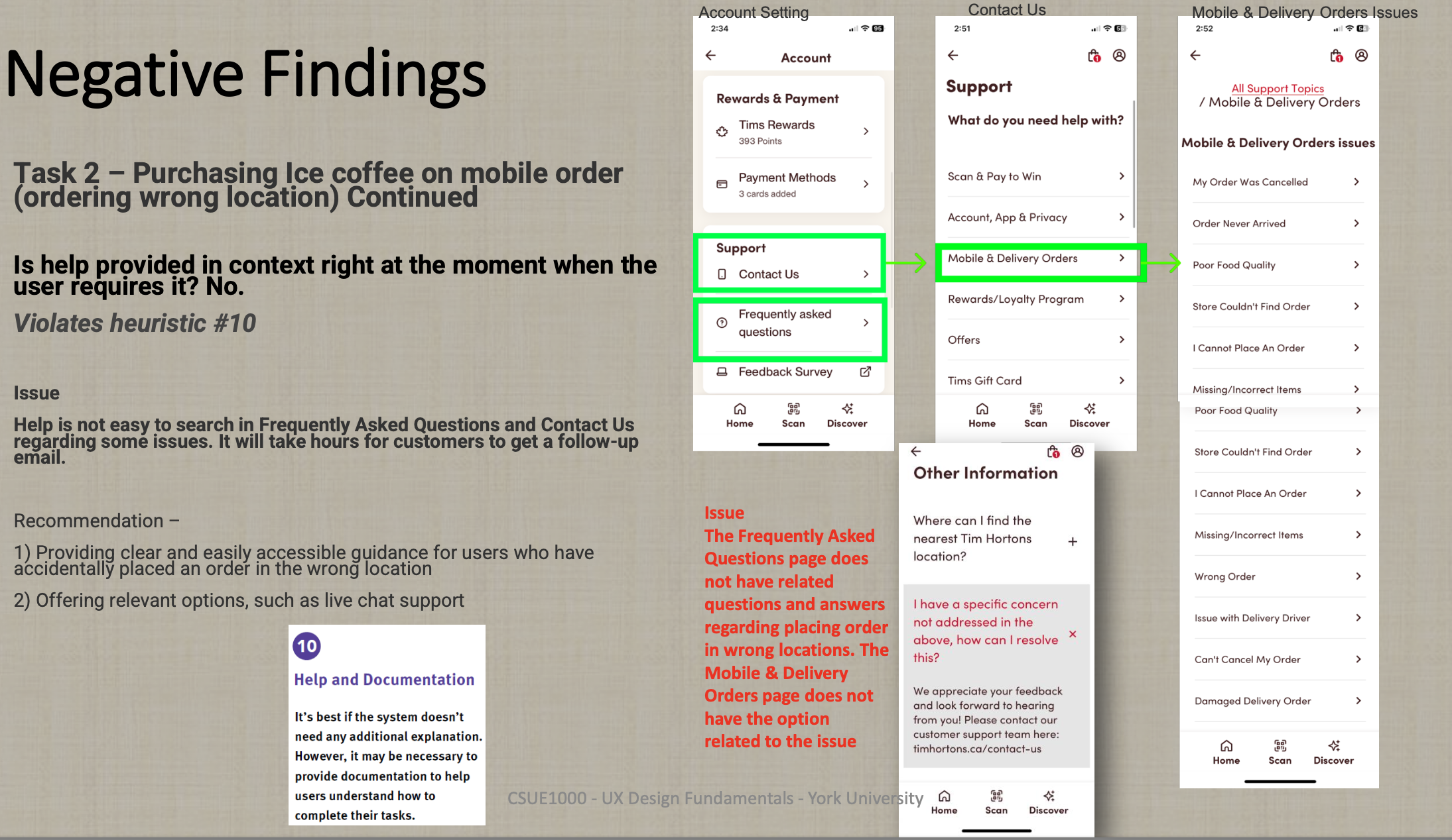
5) It does not offer an option to cancel order. Customers required to communicate their issue through the app and delay in resolution as customer support replies through emails.
Heuristic Analysis
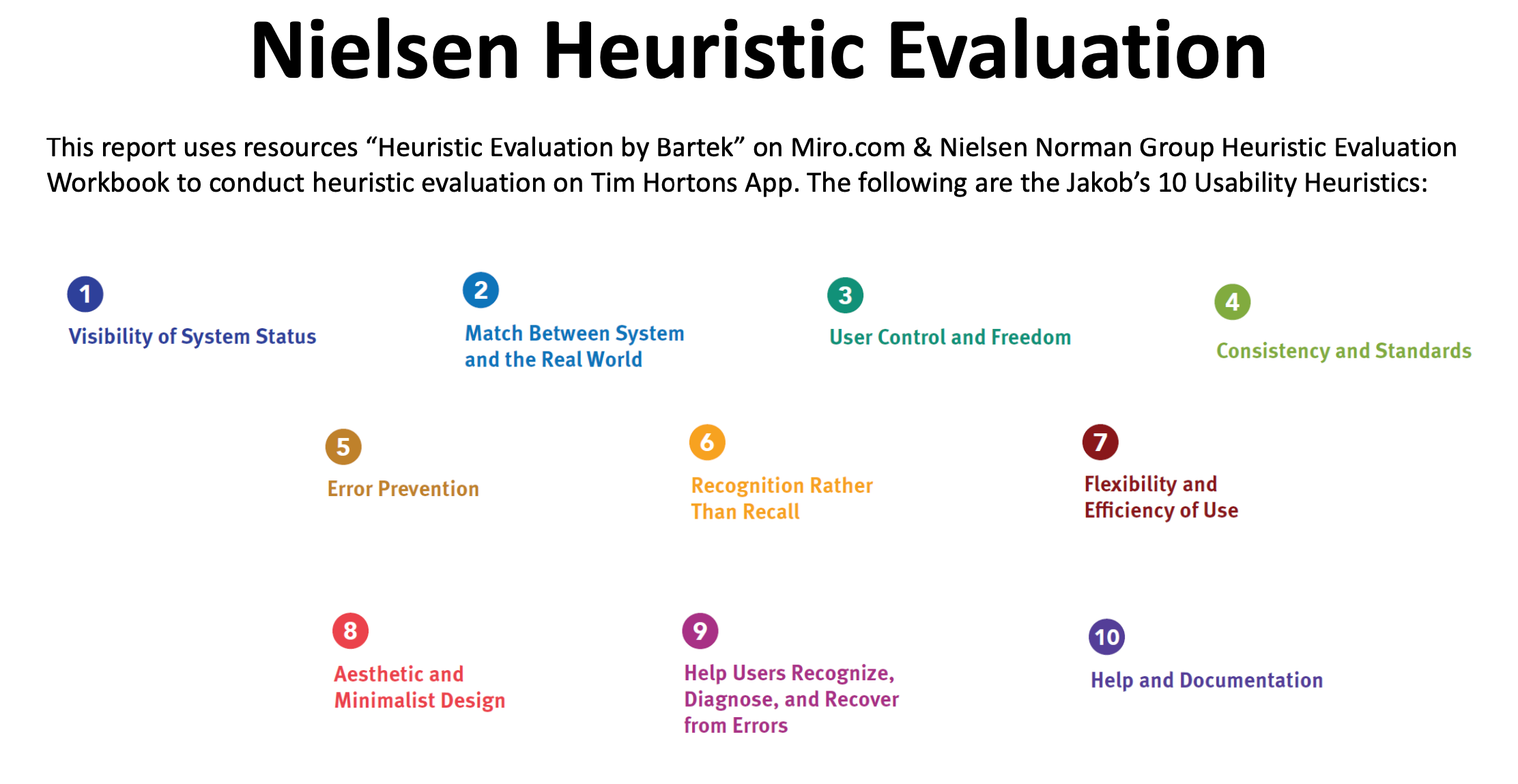
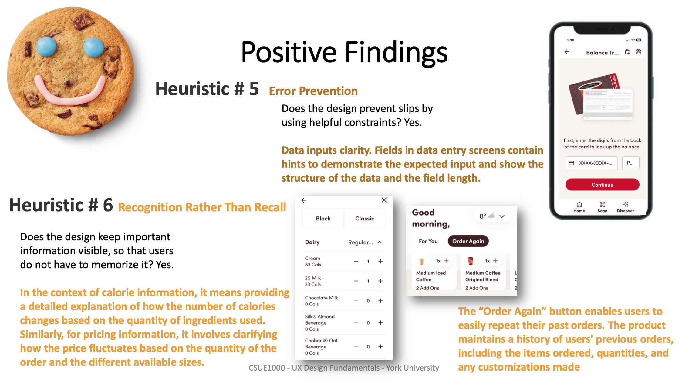
I used Heuristic Evaluation to identify Tim Hortons App’s usability issues so that to improve the overall user experience and app performance. My report containing a list of issues analysed using Jakob Nielsen's 10 Usability Heuristics, positive findings and real photos/screenshots are also included.
Recommendations:
In the short term, Tim Hortons app should focus on addressing issues that directly impact user satisfaction and engagement, such as confusing icons, weather forecast, map and location accuracy.
In the long term, a comprehensive approach is necessary. This includes investing in user experience research and usability testing to continuously identify pain points and areas of improvement.
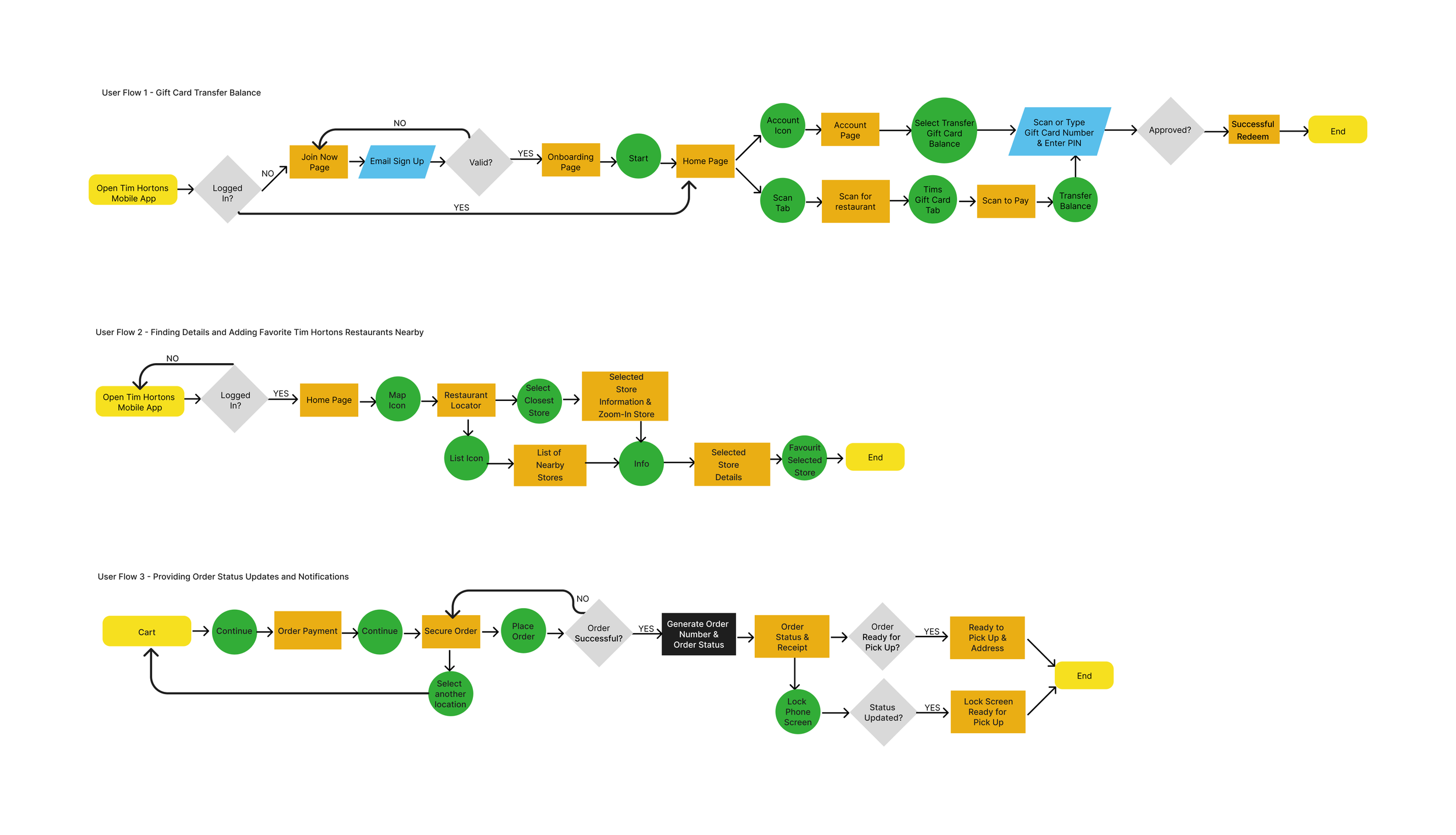
User Flow
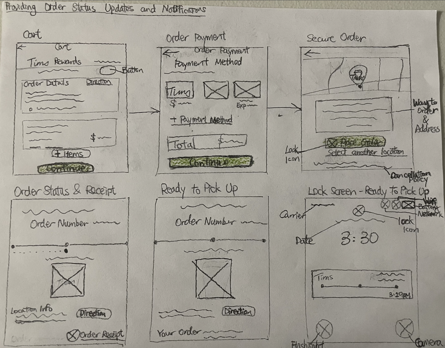
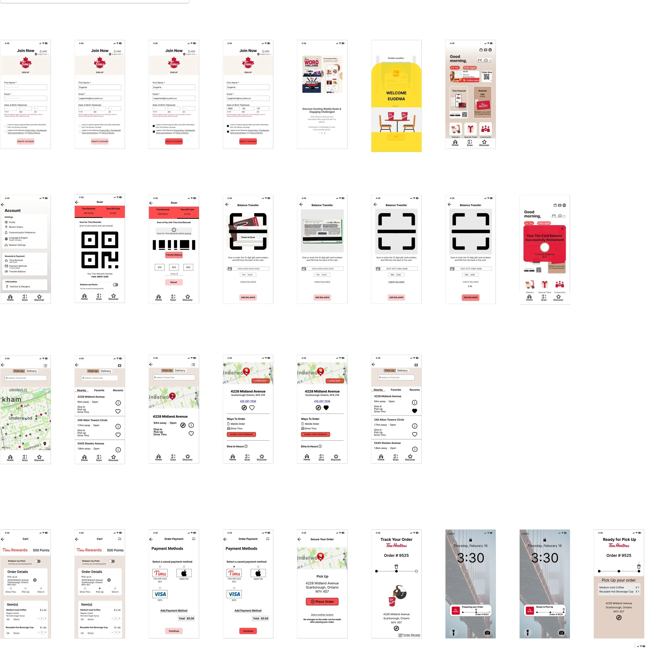
Low-Fidelity Wireframes
Gift Card Balance Transfer
Finding Details and Adding Favorite Tim Hortons Restaurants Nearby
Providing Order Status Updates and Notifications
Mid Fidelity Wireframes
Usability Testing
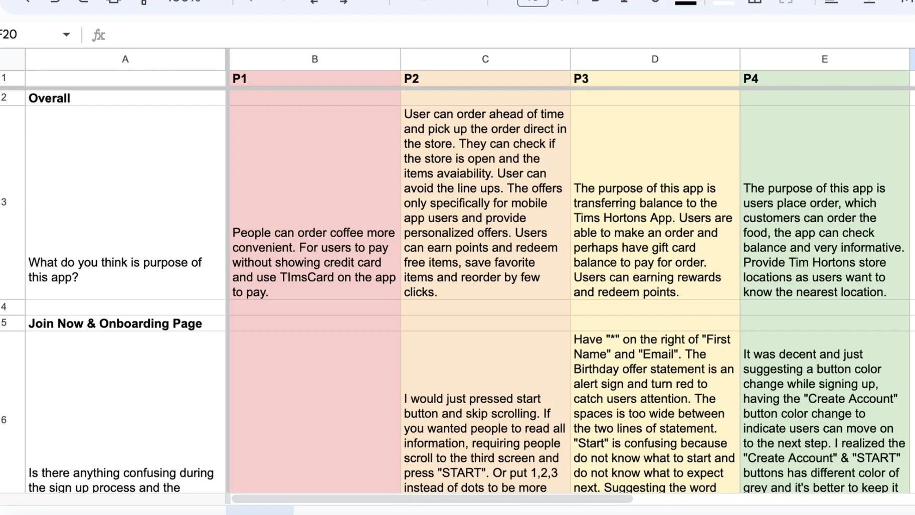
1) Recruiting Four Participants
2) Questions Creation
3) Running Sessions
4) Observations
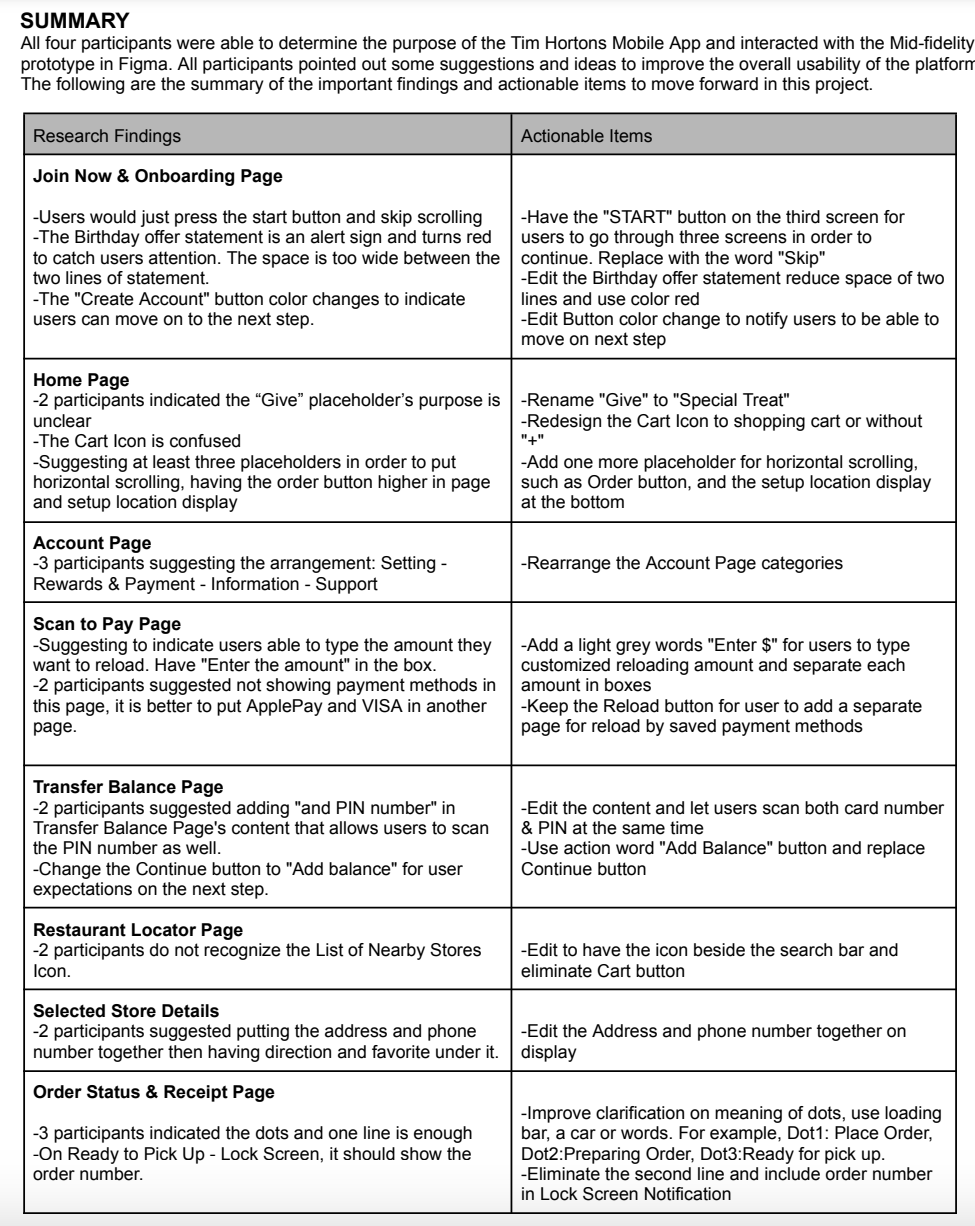
5) Findings and actionable items
Mood Board
High Fidelity Mocks
Interactive Prototype
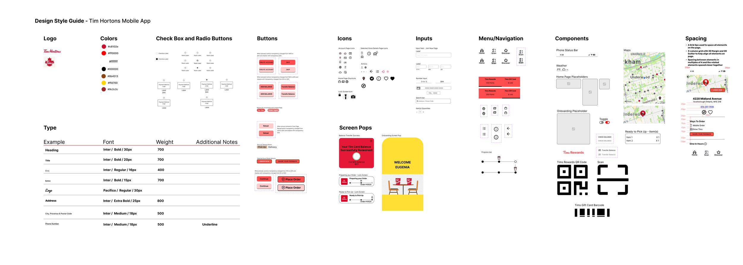
Design Style Guide
Prototype Usability Testing
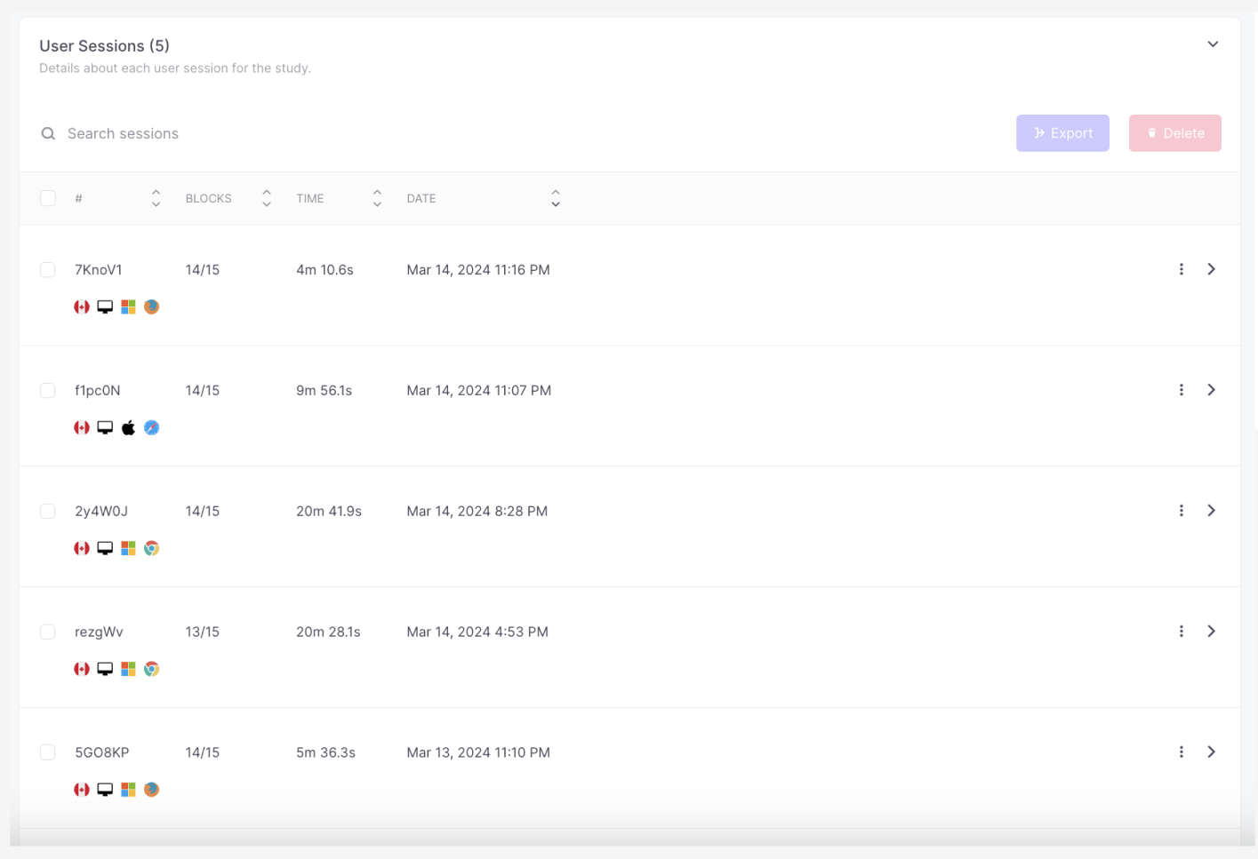
Building usability testing in Maze
Five participants took part the usability testing
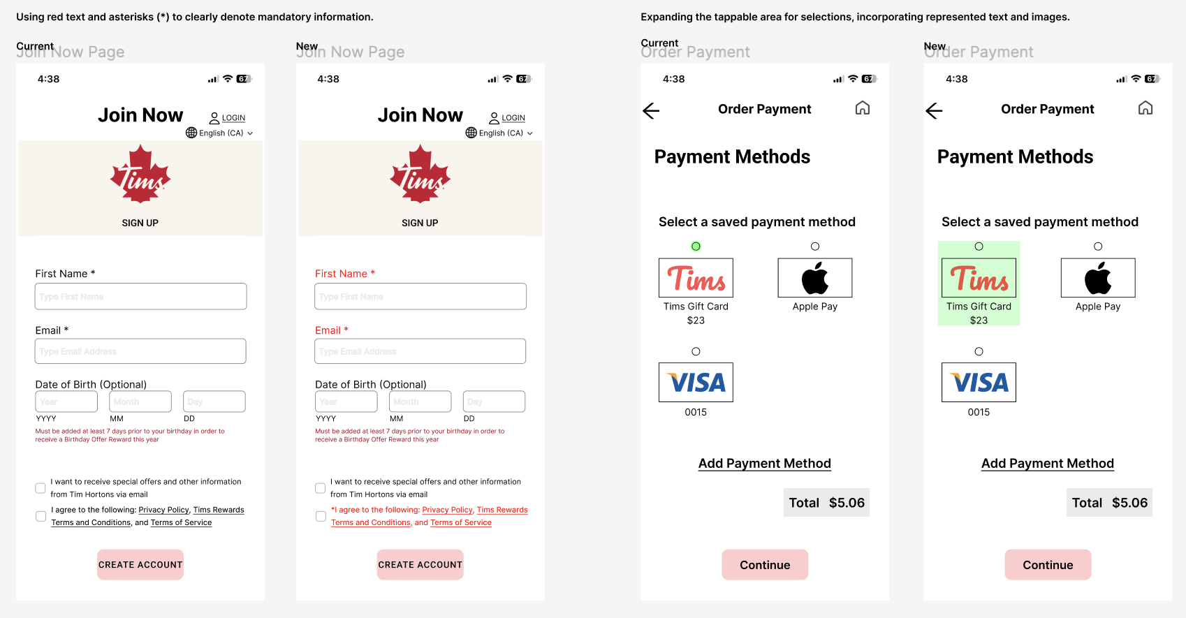
Analysis
Design Adjustments
Solutions & Outcome
Efficiency on gift card reload
Clear instruction on transfer gift card fund and make it the primary reload option for user convenience
Improving navigation and less confusion
-The map as the primary tool for locating the restaurants instead of a list of restaurant address and the distance
-The accuracy of map pin in the ordering process
Responsive updates
Real-time order status updates and notifications


